
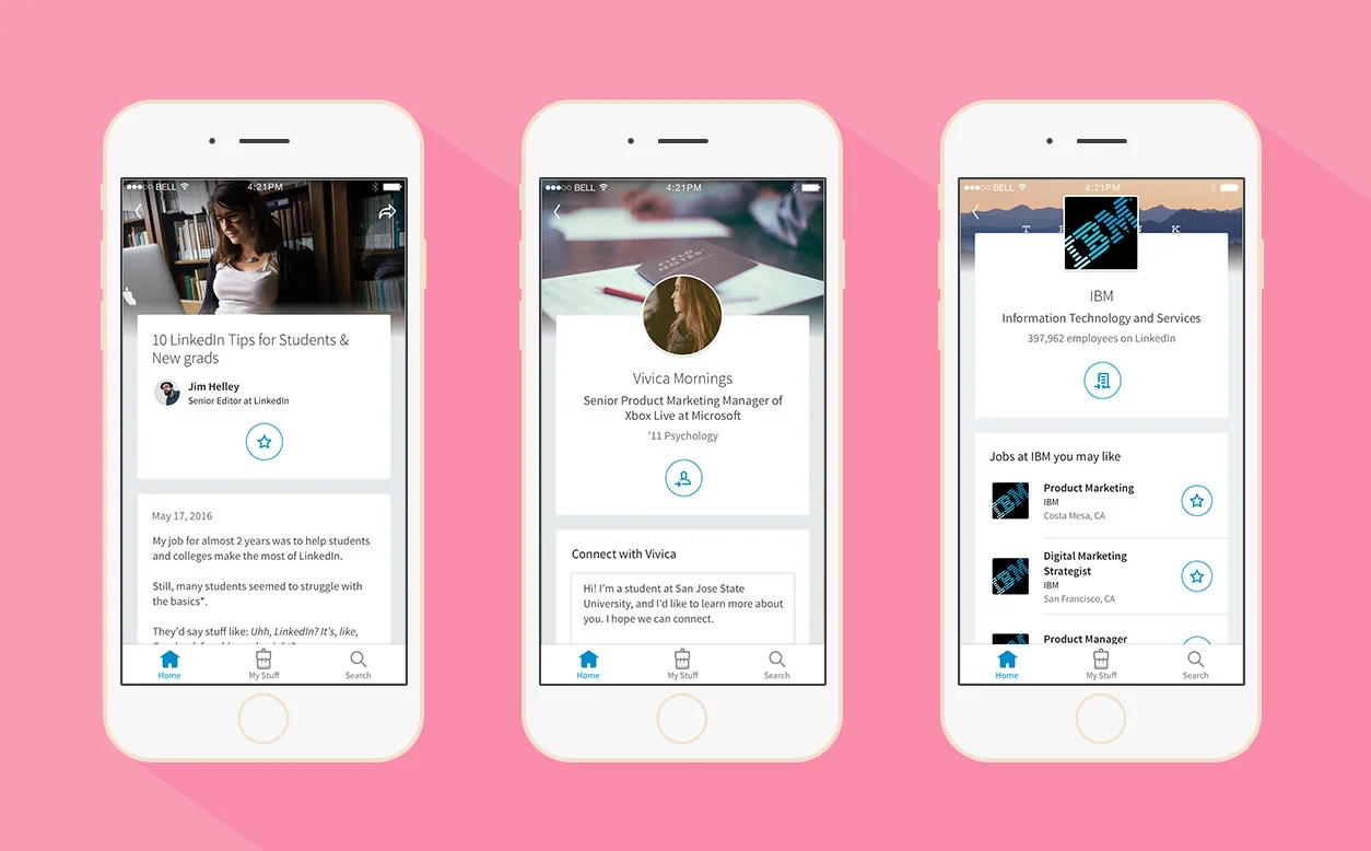
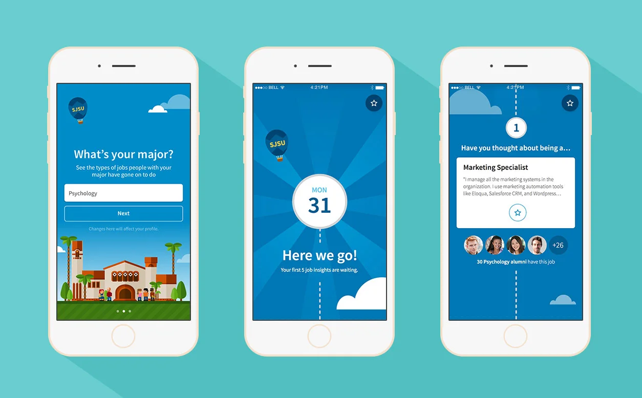
LinkedIn Students iOS main screenshots
My role
I was the designer for the project. I came up with the concept, created wireframes, supported research, created iOS / Android designs, and produced production assets.
About the project
LinkedIn wanted to help students get their first job out of college, but they weren’t sure how to do that. We already had LinkedIn.com, the LinkedIn app, and the LinkedIn Job Search app, but college students weren’t engaging with those products.
I had the great fortune of pitching to our CEO, Jeff Weiner, in May 2015, my vision of a mobile app that would help college students get their first job by helping them navigate their career. I was given a team to build the app in July 2015, and we released the LinkedIn Students app in US & Canada in April 2016 on iOS and Android. It averages 4.5 stars on both platforms and is the highest rated mobile app for LinkedIn.
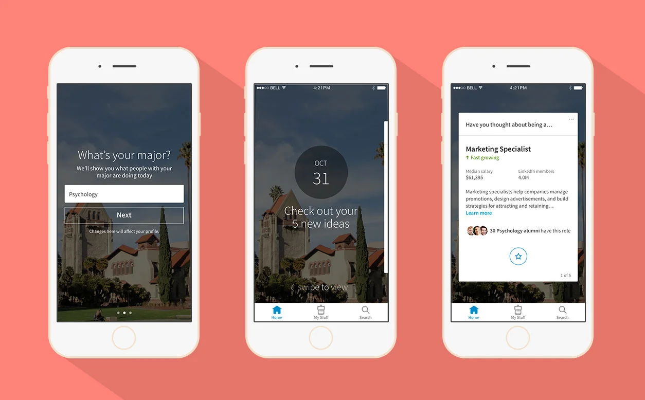
What the Students app is about
The login screens for the LinkedIn Students iOS app
Many of us know someone like this or maybe we once were someone like this. A college student who studied something he/she was interested in and when it was time to look for a job, had a hard time figuring it out. Sometimes these students figure it out, but sometimes they don’t. That’s why more than half of America’s recent graduates are unemployed or underemployed.
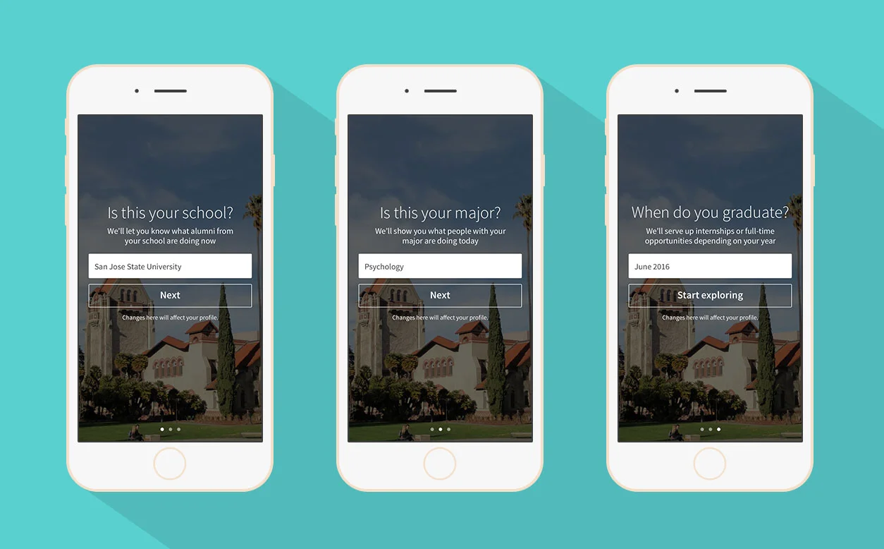
Onboarding for first time users of the LinkedIn Students iOS app
The Students app is about helping college students explore their career possibilities by taking a look at what alumni with their major go on to do, and in doing so, hopefully these students are better set up to get a great job out of college.
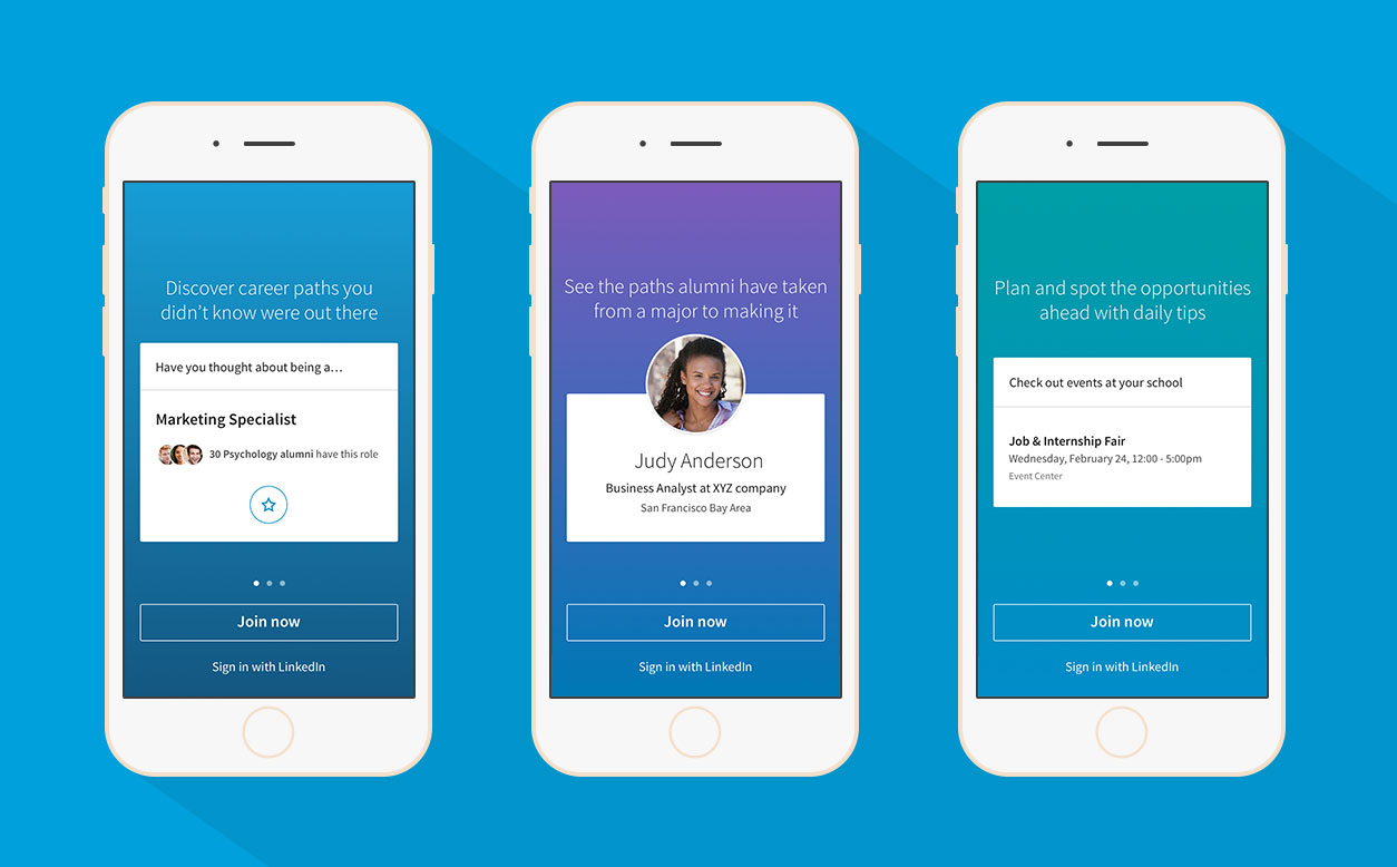
Getting more opportunities you didn’t know were out there
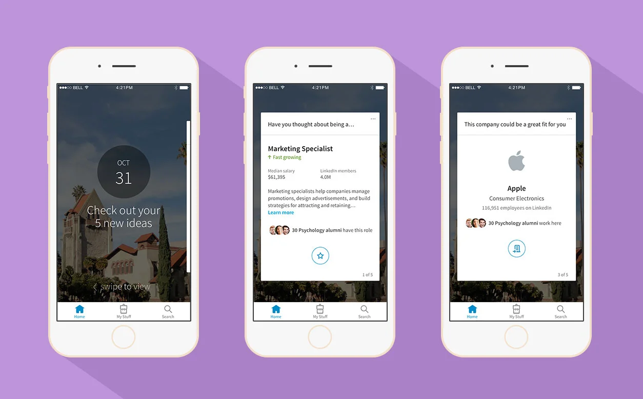
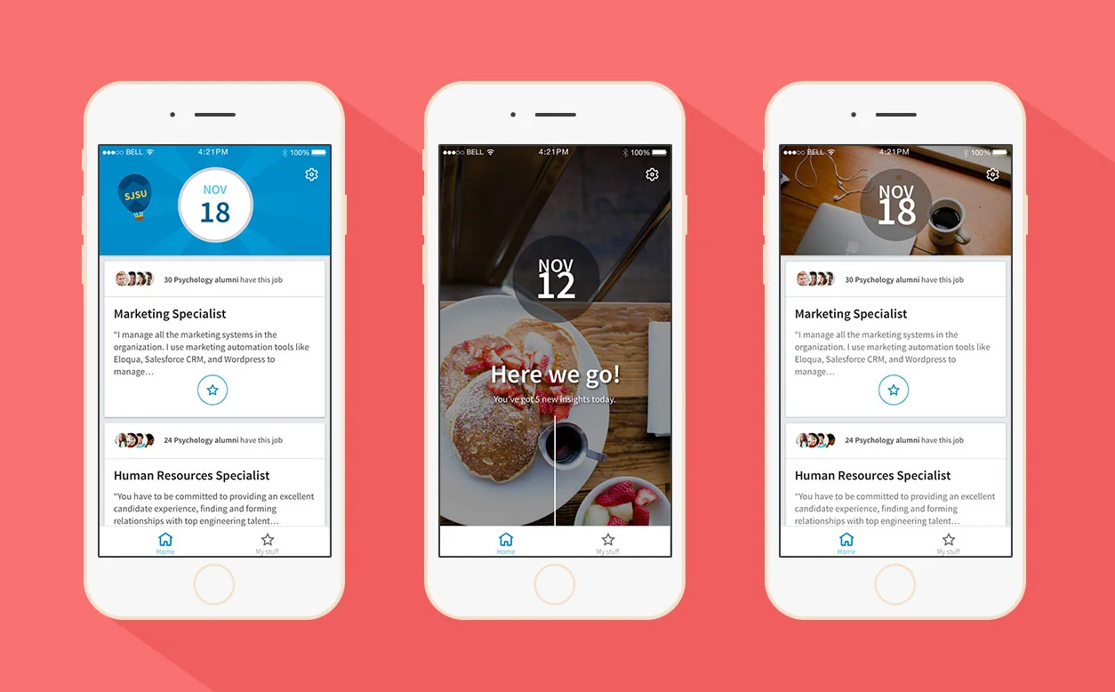
Screenshots of the LinkedIn Students iOS home page
Many college students have a hard time figuring out what roles and companies are out there and which ones they’re qualified for. That’s why we take a look at what people like them have gone on to do. People who studied what they studied and went to their school, and we surface these insights back to the students.
Learning about a better strategy
Article / Alum / Company pages - how Students can get more information on these types of entities
A lot of students don’t know how to approach getting a job. We help students understand the importance of reaching out to alumni to get more information around a role or company and potentially a job. Also, we surface career / job related articles for them to read to help guide them through the job seeking process.
Feeling confident and empowered
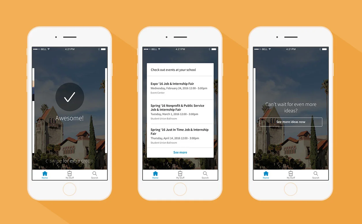
After swiping through the 5 ideas, students can do extra credit / get more cards
It’s easy to feel overwhelmed by the entire process. It’s hard knowing you’re about to graduate, and you need to pay off student loans, and you’ve been applying to jobs, and you’ve been rejected many times, and you don’t know what to do next. This app helps students broaden their job search by looking at different roles and companies they might not have heard of before. We also do this in a really easy way, by showing them 5 new ideas a day they can casually browse through, so you can be on top of your career just by checking the app for 5 minutes a day. We have ways they can learn more and do more, but at it’s core, it’s a really effortless app.
An intelligently tailored experience
Students can save things in the app, like roles, companies, and jobs, and we learn more about their preferences so we can recommend more tailored insights the next day. If a student saved ‘Google’, for instance, we might surface alumni who work at Google he or she could contact or a job at Google for a role they’re interested in.
What THE students thought
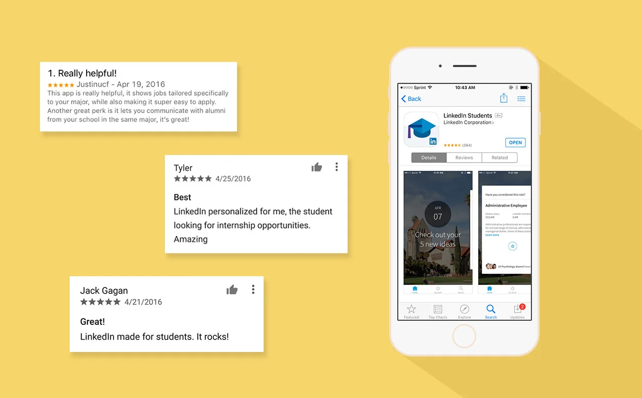
The LinkedIn Students app is rated 4.5 stars on both iOS and Android with some great reviews
We released the LinkedIn Students app in US & Canada in April 2016 on iOS and Android. It averages 4.5 stars on both platforms and is the highest rated mobile app for LinkedIn. The app was featured in many major news channels like VentureBeat, Forbes, and Fast Company. The app was also featured on both app stores under the Free Business category in April 2016.
The process of making the app
Initial concept
August 2012 - May 2015
Getting my first job out of college wasn’t easy for me. I studied Mechanical Engineering, and I wanted to go into design, but it was difficult for me to navigate that change in career path. I went through a hard time applying to jobs and many horrible interviews right out of college, and I thought that there could have been better tools out there to help me through this process.
I did eventually land a UX Design job at LinkedIn, and I positioned myself over the next few years to make a career explorer app for students by working on projects that involved students or people’s careers so that I could understand their mental models better and how we could create a tool to solve this problem. I started a side project called ‘FutureYou!’ where we created a career explorer tool with LinkedIn data to explore this concept of a career tool. Eventually, I had the great fortune of pitching to our CEO, Jeff Weiner, in May 2015, my vision of a mobile app that would help college students get their first job by helping them navigate their career. I was given a team to build the app in July 2015.
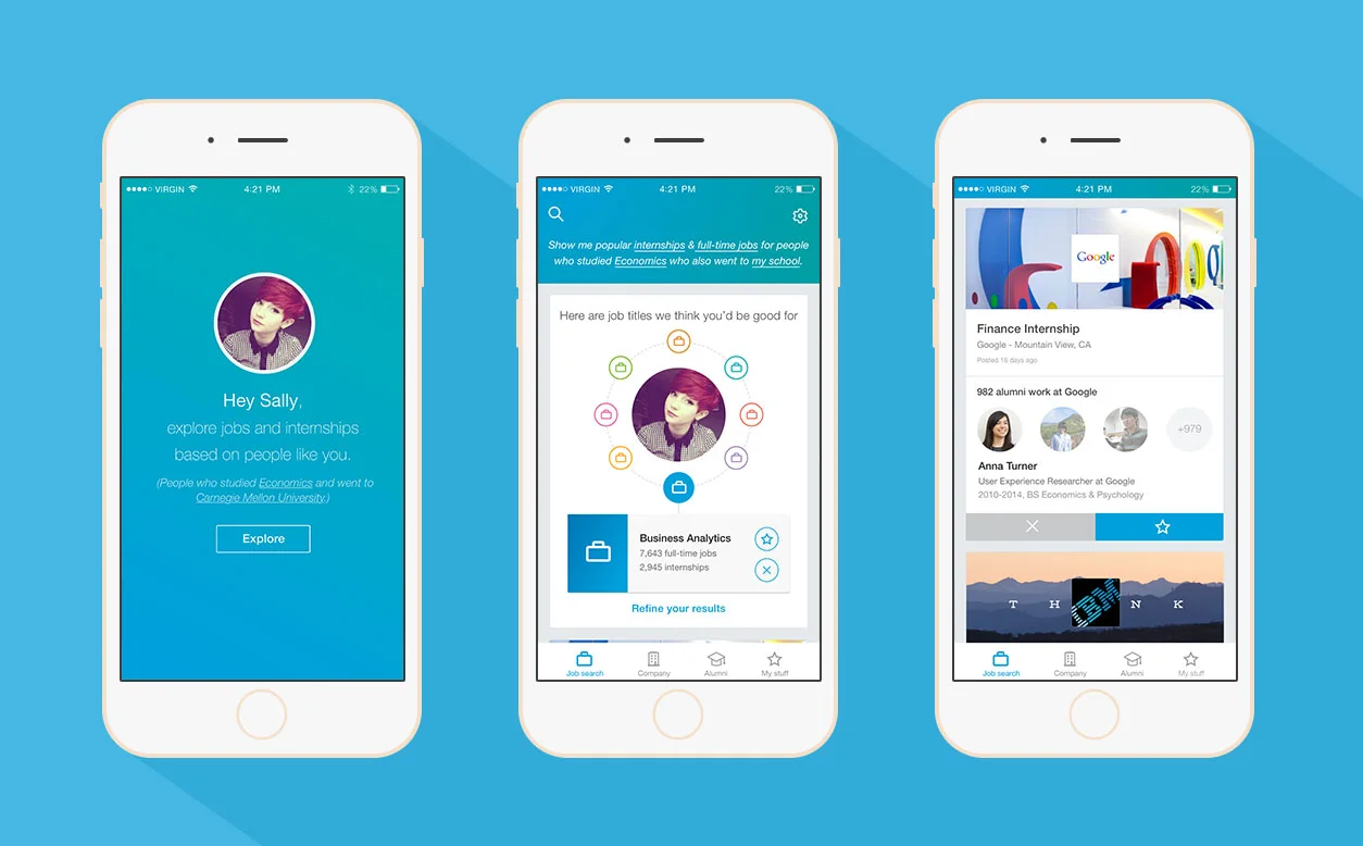
Mocks from the initial Students app concept pitched to the executives
In this initial concept, I proposed that instead of asking members to fill out a LinkedIn profile or fill in an empty search box, we start with questions they can answer, like what is their school and major, and we show them different roles, companies, and jobs they could be qualified for based on what people who studied what they studied and went to their school went on to do. We also showed students these alumni so that they can possibly contact them to get advice on getting a job at their company or how to apply for their type of role.
Pilot / user research with San Jose State University
November 2015
Screenshots of the pilot LinkedIn Students iOS app
When the team was assembled in July 2015 to create this app, I understood at the time that we had the right value prop, but we still needed to answer a lot of questions in terms of the mechanics of the app, so we created an iOS pilot app for San Jose State University in November 2015 with our best thoughts and worked with User Research to figure out some these unknown issues.
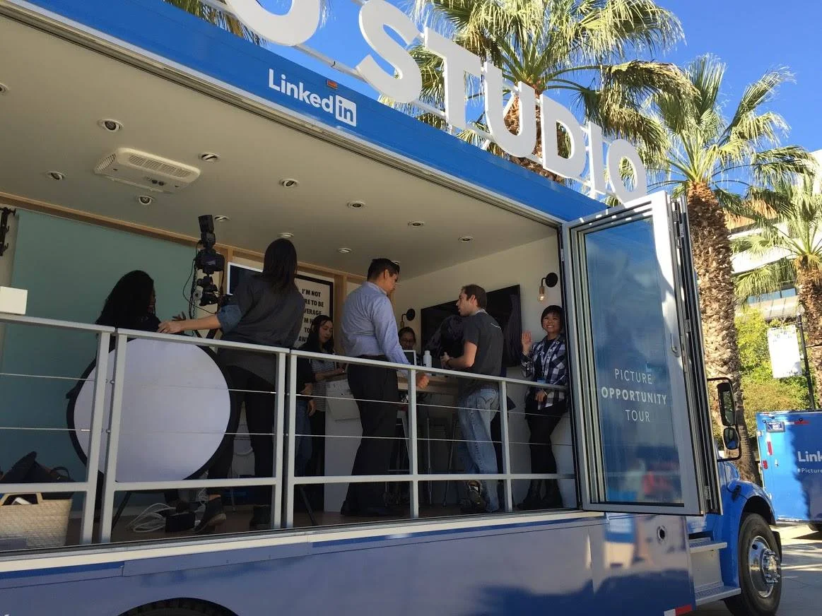
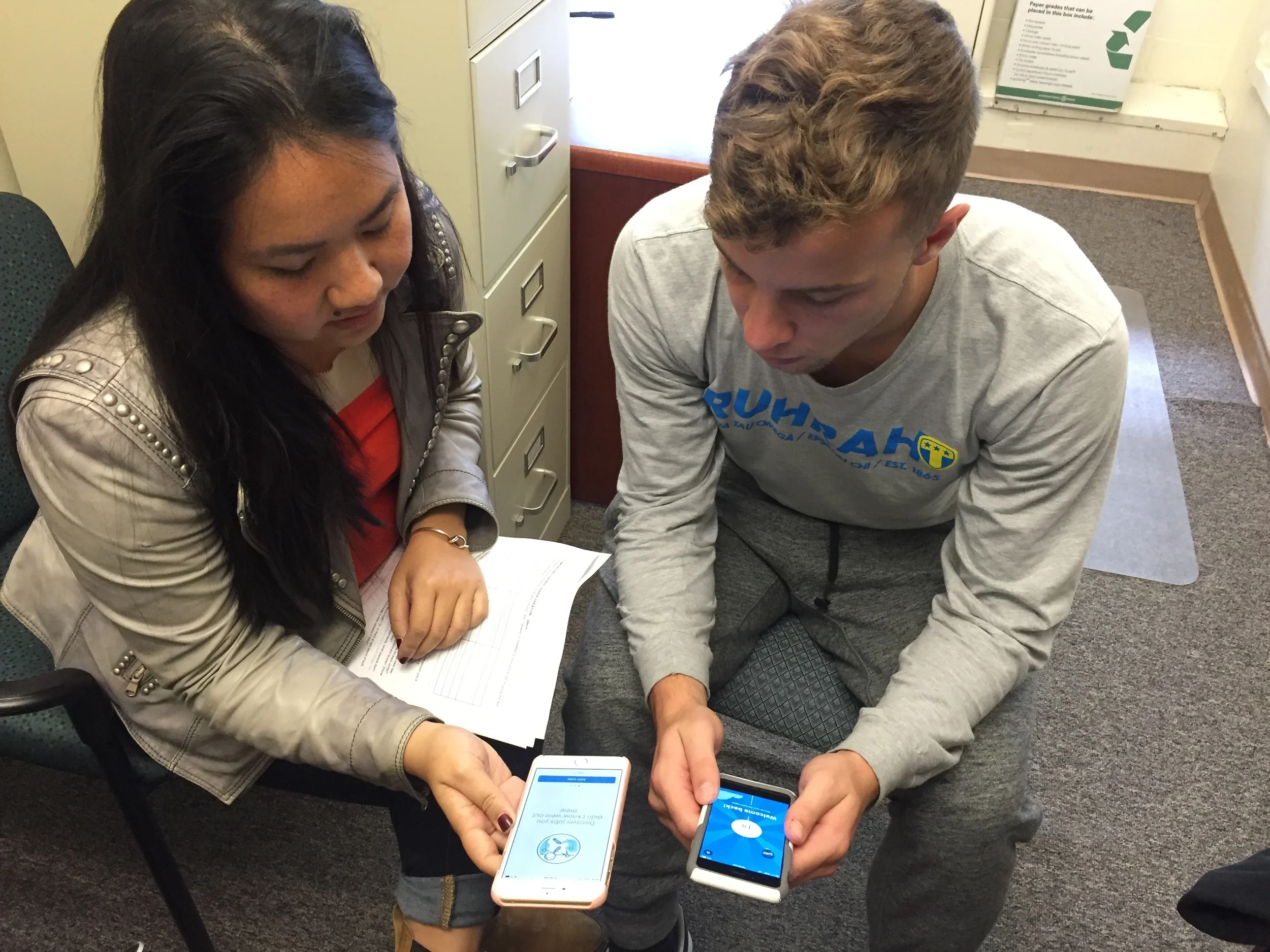
At San Jose State University November 2015 piloting the LinkedIn Students app and helping students with their crafting their LinkedIn profile and take a professional headshot on the LinkedIn Picture Opportunity Tour bus.
With the User Research team, we were able to conduct a diary study for 7 days with 17 participants from San Jose State University. These students used the pilot app for all 7 days. We asked them questions everyday about their experience using the app and other questions we had concerning the app. After the 7 days, we brought 15 of them in and interviewed each of them separately for 1.5 hours each about their thoughts on the app and what worked and what didn’t work and showed them models of the other concepts we had. The following are some of the key unknown issues we wanted to understand.
Screenshots of the other types of feed tested for # of content and visuals
Limited vs. unlimited cards
How many ideas should we give students a day? It wasn’t clear to us what was the better method, a limited home page where you can only access a certain amount of things a day like the Coffee Meets Bagel app where you can only judge one potential date a day, or an unlimited home page feed like Tinder, where you can have an endless amount of potential dates.
Pros and cons of a limited home page
We thought that having, let’s say, 5 things a day to look at would help students feel better about the app since it was easy to do and finite, so it wouldn’t be mentally overwhelming, unlike the job searching experience they were currently facing. We also felt that students would probably come back to the app if we limited the amount of insights since there was an incentive to get more value the next day. The downside is that if we didn’t get the 5 cards right on the first few days, students would never come back to the app and power users may want to see everything at once.
Pros and cons of an unlimited home page
Having an unlimited home page could mean that each idea that we had to deliver the students would hold less weight since if something wasn’t relevant, users could easily move on to the next card. The downside is that if we give them all the value the first day, what would be the incentive in coming back the next day? We also knew that the app would be more effective over multiple days of use since it can grow with you and get to know you more and suggest broadening ideas, like new roles and companies to apply for, when your job search doesn’t look so good. Also, we don’t have an unlimited amount of insights to deliver since there will only be a handful amount of roles you could be qualified for.
What the students thought
After research, it was decided that having a limited home page of a cadence of 5 insights a day was generally perceived to be the right amount of content.
"College students don’t have a lot of time and 5 didn’t feel like too much. Didn’t feel too overwhelmed. I can do that. It’s simple." - Sierra
"It didn’t feel it was too much. Five was a good amount of content. I always went down to the bottom. 60% i’d consume more content by scrolling past the bottom." - Ronald
Plain vs photographic vs illustrative
We wanted students to feel that the app was customized for them and made for a younger audience. At this point, we weren’t sure which aesthetic style to go with. Should it relatively plain like the LinkedIn app? Should we use a photo of their school for a custom, but professional feel? Or should we use an illustration of their school for a custom and fun look and feel?
What the students thought
After research, we understood that photographic style was the way to go, and whenever possible, a nice photo of their school was delightful, and they liked the professional feeling of a photo vs an illustration. An illustration felt too kiddish, especially since this app is about their career.
User research with the SJSU diary students participants